Case Study
Design Process &
Product Walkthrough
This is a visual summary of my work as a Senior Designer with ChefsFeed from March 2019 through December 2020. Hired following an acquisition as the founding in-house product designer, I worked to evolve the company’s platform from media and content to e-commerce event marketplace. With the goal of putting more money back into culinary expert’s pockets, I merged and redesigned the product suite, contributing to visits +50% and users +100%.
Just as we hit our stride with ticketing, COVID forced innovation, and I suggested a pivot to livestream experiences. We reworked the user journey, assembled a minimum viable product, and gained 10x new hosts and 300% more seats sold as we launched in March/April 2020. It’s been a hard year, it feels great to provide an outlet for these experts to create their art, feed their communities, build a following, and make extra money.
Background
ChefsFeed connects experts to consumers
for authentic food & dining experiences
driven by brands
Define the Problem
ChefsFeed acquires Feastly
Media Site + Event Marketplace = ?
How do they fit together so that content and experiences flow seamlessly while providing maximum value to food and beverage experts?
Set the Project Mission
Merge ChefsFeed with the newly rebranded ChefsFeed Experiences (CFX) event ticketing platform, so experts can put more money back into their pockets.
Identify Constraints
Time
90 days - design and development timeline
Tech
Two tech stacks, two engineering teams, etc.
Team
I am the founding and solo in-house interface designer with support from contract designers as needed.
There are only a handful of previous design files for reference.
Trends
Business model and sales team priorities can always shift as products are developed.
Research & Discovery
Tap into CURIOSITY
Keep an OPEN MIND
Be EMPATHETIC
Remain DATA-INFORMED
This step allows me to put the user at the forefront and become an advocate for them. Build for the people, design for the least able to use the product.
User Research Audit
What tools are available to study my users?
I start the research process by understanding what information exists to study more about my three groups of users. Making experts money is my overall goal, the consumers help drive that, and brands finance it.
All three groups are well represented by digging into current trends, best practices, and design standards.
I also have site and app usage data and analytics to help me understand each group and their actions separately.
Recent survey results exist for both the expert and consumer groups, which help to dial into motivations and drivers for this specific platform’s users.
User interviews are my favorite form of research, as you really get to learn individual stories and pain points, begin visualizing solutions, and find patterns throughout. The interviews help give more qualitative insight that links to the other more quantitative methods.
Trends & Best Practices
I’m always searching and studying ways to improve digital products and tools.
This includes
a list of similar or complimentary brand websites to visit
screenshotting specific components and to identify best practices
dig into journal articles and research on cognitive science and accessibility specifics
cross reference with standard design systems such as Google’s Material Design or Apple’s Human Interface Guidelines
As a life-long learner, every day and experience with digital tech is an opportunity to study and improve my work. I’m continuously keeping a record of ideas while consuming social media, newsletters, conferences, new products, etc.
Site Data
I started my career as a research scientist, which means I love digging into data - tinkering around in a data tool like Google Analytics, and building out dashboards to monitor in support of my work.
Site data helps most with understanding user demographics, where they are located, what devices they’re using, what content they’re most interested in, etc. This also reminds you that the global digital audience should be considered and not just US residents or English speakers, for example.
Data identify boundaries of your audience group that can be pushed as you cast a wider net for users in the future.
Survey Results
I had access to previous survey results for both consumers and experts, shining a light on specific problems both groups were experiencing.
Consumer results dug into buying behavior, what sites they most frequently visit, where they see room for improvement in the product, and what they’re looking for from culinary talent beyond content.
Experts most needed mobile capabilities for their event management as well as more features to support their guests. For experts, it’s all about the user too, their customers.
User Interviews
While site and survey data provide a glimpse, 1:1 user interviews are where you get an in-depth look at individual experiences and pain points. Previous data-inspired assumptions are confirmed, new potential solutions emerge, and you gain anecdotal reasoning for your design decisions.
In this case, following 10 expert interviews, I organized by subject and identified themes. I then thought about how these themes connect to the overall information architecture and customer journey, and the opportunities that exist in order to better serve users. Rank by urgency, and you’ve got the start to a helpful product roadmap.
User Persona
Q: Who am I designing for?
A:
Talented artisan chefs with valuable career experience
Bringing their own style of cooking to their communities
Using thoughtful ingredients and methods to create specialty products
Partnering with authentically aligned brands for greater exposure
Gaining further recognition and resources to collectively thrive and give back
Consumers are looking for unique experiences and connections to these experts.
Start Sketching
Wireframe
Understanding user needs and how they align with the existing platform - it’s time to put pencil to paper. By brainstorming and sketching out basic wireframes, I can explore different user flows, options for layout, individual components, and more. How do the puzzle pieces best fit together?
Digital Designs
Mockups
After several great wireframe solutions, it’s time to head to Sketch (or other design software of choice), and bring them to life. By presenting options in a more refined style, stakeholders are better able to provide feedback and help work toward a final product.
At this step I zero in on reducing ambiguity among the complexity - hero image appearance, preferred wayfinding format, moving image capability, component contents, section flow, edge case nuance, and much more.
Collaboration & Feedback
Creative facilitation techniques provide a comfortable environment for others to share ideas.
We can explore solutions together while I stick to design principles and advocate for users.
Collaboration with stakeholders - product management, engineering teams, CEOs, colleagues in other departments - improves my work and the product.
Opportunity to Push Boundaries
Test out new ideas and challenge how things have been done before, letting your creativity shine in the process while providing researching to support concepts.
In the end, it’s about simplifying the solution, not standing out.
Let the users do less to achieve more.
Multiple Solutions
Iterating
Based on feedback and continuous problem solving, the product goes through several iterations, honing in on specific features and formats such as how the CTA appears, or what is above the fold on mobile, etc.
Final Touches
Optimization
Once everything has been decided and we’re almost ready to hand off the designs to developers, I tune into every detail on the site and ensure it’s ready. This includes aligning with brand standards, AMP designs, and accessibility tests.
Handoff
Development
Clear, seamless communication and feedback loops are essential when working with product and engineering teams to reach a successful final outcome. Tools and methods include
Sketch designs uploaded to Zeplin
Tickets created and monitored in Jira
Timeline and roles determined in Sprint planning
Progress monitored with daily standup
Open availability on Slack & Google Meet
Live view of progress and testing on staging site
Results
New, completed homepage design
Clean, bold hero featuring award-winning video content
Clear mission statement.
Content organized into three prominent, defined sections
Horizontal scrolling sections for majority mobile users
Product Merge & Homepage Complete
What’s Next?
Adaptive Design
Complete the Suite of Products
Subtly editing details across products - in this case iOS, Android and AppleTV - improves usability and growth.
I started at wireframes and followed the same steps when designing components like:
menu structure
search format
navigation bars
e-commerce item pages
user account management
iOS homepage
E-commerce
Event Marketplace
Starting with specs, I whiteboarded to determine information architecture and user journey solutions. I used paper prototypes to test with colleagues and perfect the flow. By utilizing members of different teams for paper prototyping, I could get various perspectives on ecommerce and mobilize them around the product.
In order to reach the final product, I optimized the conversion funnel by researching features like promo code entry, updating order at checkout, add-on items, and more.
FYI - based on the goal of supporting culinary experts, ChefsFeed only charges a small processing fee to customers and has no charge for professionals to use.
Test, Learn, Get Feedback, Repeat
Metrics
Methods like A/B testing, user surveys, simulated site visits, and O&O testing create a bigger view of design’s impact using metrics.
Analytics provide more quantitative insight and, in the case of this homepage, the following wins:
Site visits +50%
Users +100%
Number of Items Purchased +30%
Media Impressions +380%
Industry Validation
Clear feedback from the market as ChefsFeed was featured on the iOS App Store, including in an editorial alongside TikTok.
User Followup
Stay in Touch
Keep communication open, let users know you’re available for feedback and give direct paths to do so.
Room for Improvement
Design System
Always looking for ways to improve, following the initial site merge I took a step back and reflected on what could be done better. In hindsight, I wish I had built a design system first to set standards across the platform. At the time, it was not a priority, however it would have saved time if implemented from the start.
To build a design system I took the following steps
Audit the current platform for an understanding of existing components
Present concept of design system and benefits to senior leadership, get buy in
Build plan for design system development across platform products based on urgency and priority
Create design system components supported by industry standards
Upload to Zeplin and work with development team to implement
COVID Hits
Innovation
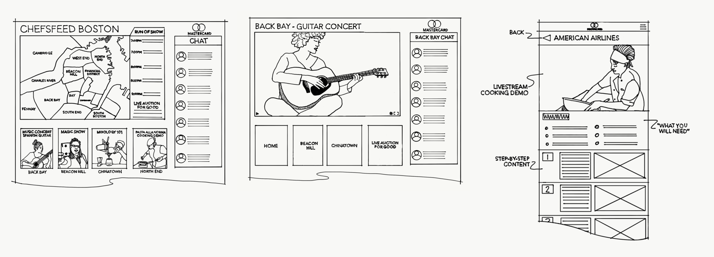
We had just built out a new event marketplace for in-person experiences with culinary experts. COVID hits and all of a sudden in-person no longer exists. What do we do?
Get creative.
Support the Users
Livestream Experiences
The users we support were in a difficult spot and we needed to step up and support them where we are able. Based on inspiration from Mule Design’s Book Club livestreams, I suggested a similar solution for our platform.
We adjusted the customer journey and made tweaks to the product in order to support livestream ticketing, using YouTube Studio for the video streams.
We have provided this outlet to culinary experts and users have successfully built online communities and made money during a time when many are without options.
This pivot to livestream experience ticketing raised individual items purchased by 300% and new hosts on the platform by 10x during Spring 2020.
Next Level
Livestream Platform
Stronger support for livestream experiences with our own livestream host and viewer products. Solving new problems every day, like chat on fullscreen mobile landscape.
Empowering Users
Designing for users drives product impact.
Focusing on experts making money creates a platform where consumers are entertained and informed while brands receive engagement.
Thanks for continuous learning, team collaboration, constant evolution and challenging big ideas throughout the design process.


